


Apps collect data. Heaps of it. However, that data only matters as long as users can make use of it. Now that's where dashboards come in.
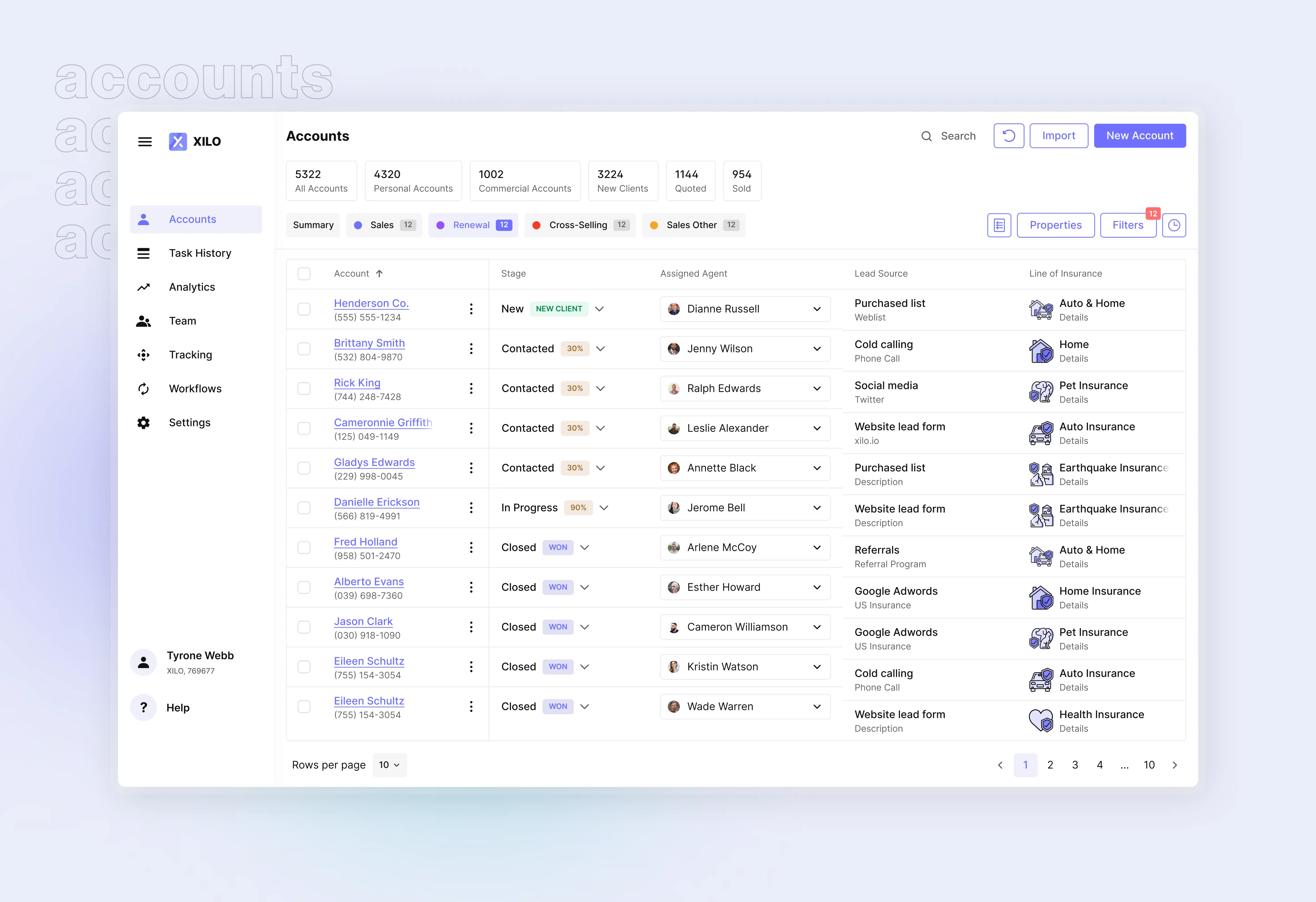
A dashboard is a visual display of key metrics and actions, giving users quick access to what matters. Whether it’s a sales dashboard, financial dashboard, or operational dashboard, a well-structured layout is paramount for clarity and decision-making.
In this guide, we’ll break down essential dashboard UX and design principles — helping you build an effective dashboard that’s clean, usable, and tailored to real user needs. Let's dive right in!
What is a dashboard
A dashboard is a visual display that brings together key data points, controls, and summaries in one place. It gives users an immediate overview of what’s important, whether that’s sales performance, KPIs, or system status.
Different types of dashboards serve different goals:
- Operational dashboards track day-to-day activity
- Strategic dashboards support long-term planning
- Sales dashboards focus on performance and pipelines
No matter the use case, a well-designed dashboard turns complex data into actionable insight.
Dashboard design best practices & principles
Let's break down a few key principles to get your dashboard design on the right track.
{{{{service-card}}}}
Solid user insights
With regards to user research, you can choose two paths. The first one is the easy one: see what the competitors did, design an average of that with your own branding. The second path is harder but a lot more effective: to put effort into user research.
The foundation of any effective dashboard design is understanding your users. To ensure relevance, base your decisions on real behavior and needs. Use methods like:
- User interviews to uncover goals and pain points. That way you can integrate the dashboard into real workflows;
- Card sorting to structure dashboard elements the way user expect;
- Usage data (if available) to track how users interact with the interface.
This interaction design work shapes a more user-friendly dashboard that fits real workflows, not just assumptions.
Data Visualization
A great data dashboard UX helps users grasp information at a glance. Use visuals to simplify, not complicate:
- Use clear bar, line, or area charts for trends and comparisons;
- Avoid 3D charts — they distort perception;
- Skip pie charts with too many slices — they become unreadable;
- Don’t overload with textures or colors — they create visual noise.
Well-chosen visual design enhances comprehension and reduces friction.
Visual hierarchy
One of the core dashboard design principles is guiding attention through hierarchy. Users shouldn’t have to hunt for important information. It should emerge naturally through visual design.
To achieve this:
- Use size to highlight primary KPIs or actions;
- Apply color sparingly to signal urgency, state changes, or category;
- Position high-priority items in F-pattern or Z-pattern layouts — proven design patterns that match how people scan screens;
- Use whitespace and grouping to separate content into scannable zones.
This is especially important for responsive dashboard layouts, where limited screen space on mobile apps demands clarity above all. Whether you're designing for a dashboard app or a web app dashboard, structuring your layout around hierarchy helps reduce cognitive load and improves user experience.
Customizable dashboard layout
No single layout fits every user with every use case. An effective dashboard gives users control, allowing them to tailor the dashboard to their goals, preferences, or role.
Consider features like:
- Rearrangeable widgets (drag-and-drop);
- Hide/show toggles to declutter unused sections;
- Saved filters or layouts for recurring use cases.
This approach works especially well in complex management dashboards, sales dashboards, and marketing dashboards, where different teams focus on different data points. Giving users the ability to design their dashboard (within reason) leads to higher engagement and a more user-friendly design.
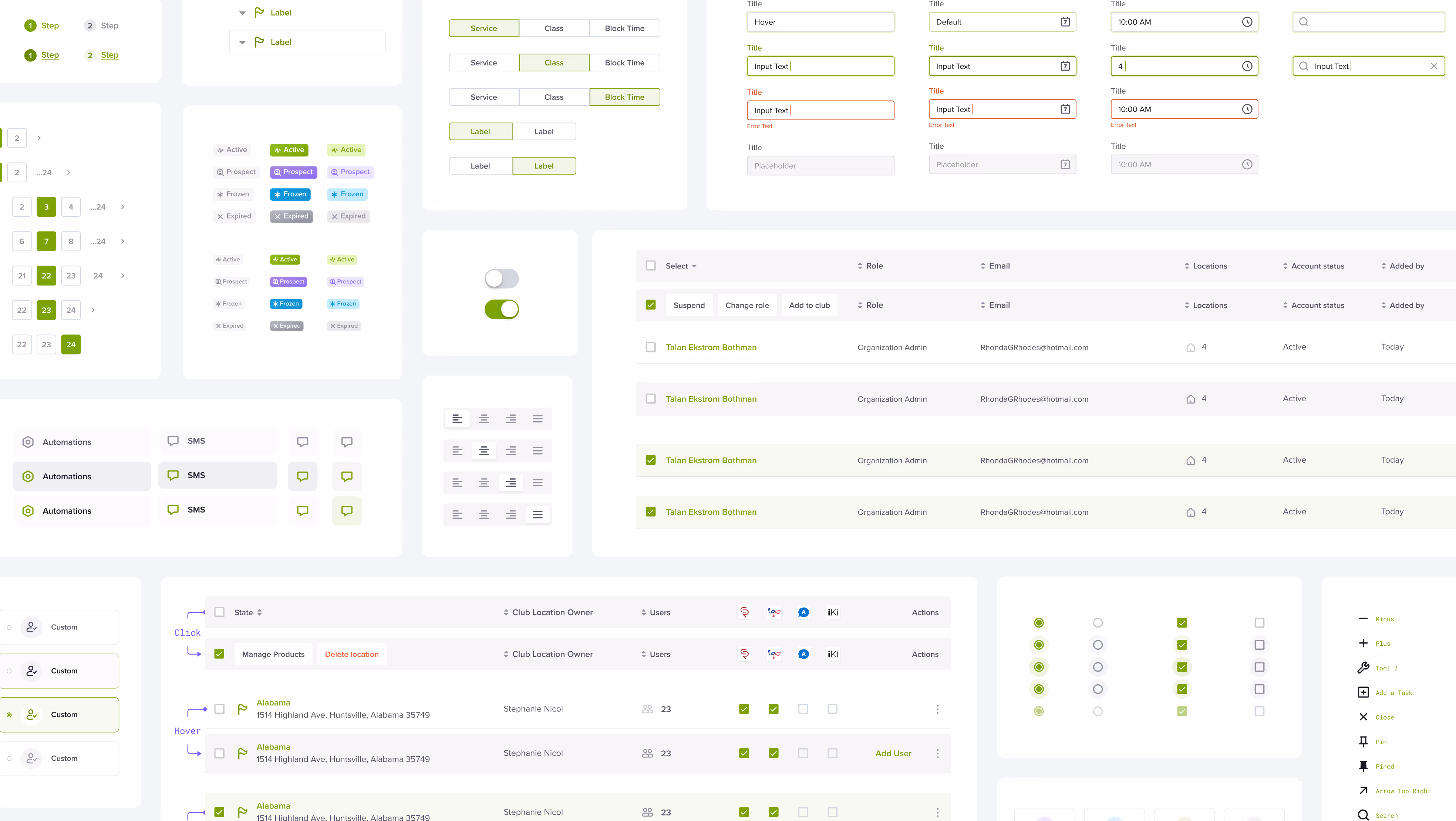
Clean UI design
A usable and functional dashboard doesn’t try to impress. It tries to help. Clean UI starts with restraint. Avoid the temptation to add extra icons, shadows, gradients, or animations unless they improve usability or comprehension.
A few best practices for a clean dashboard UI:
- Use consistent spacing, alignment, and typography;
- Minimize labels by using intuitive icons (with tooltips where needed);
- Ensure text and background contrast meets accessibility standards;
- Limit your color palette to functional use, not decoration;
- Make call-to-actions (CTAs) stand out without overwhelming the screen.
In short: aim for a simple dashboard that feels calm and deliberate, not busy or overwhelming. Clarity wins over cleverness.
Common dashboard UX design mistakes
Even experienced teams fall into traps that hurt dashboard UX. Here are some of the most common, and how to avoid them.
Build now, design later
In fast-moving projects, teams often rush into development without a proper design process. Engineers start building dashboards from scratch, often without research, structure, or consistency.
This results in:
- Unclear data flows
- Redundant or misaligned widgets
- A fragmented user experience that needs to be redesigned later
Good dashboard design isn’t a finishing touch — it’s foundational. Involve UX designers early. Treat dashboards as key parts of the product, not technical add-ons.
UX isn't an icing on top you can add later. It's structural. To continue the baking metaphor, it's the flour.
Designing for Dribbble, Not for Use
Dashboards are not portfolio pieces. They can be, but that should be the least of designers' priorities. Overdesigning for aesthetics with fancy gradients, glassmorphism, or overanimated transitions often leads to cluttered interfaces and poor dashboard UX.
A great dashboard design is invisible in the best way: users focus on their data, not the design. Avoid unnecessary flourishes that distract from content.
Blindly Following Trends
From neumorphism to hyper-minimalism, UI trends come and go. While trends can spark ideas, applying them without context can harm usability — especially in data dashboard UX, where clarity is king.
Every type of dashboard serves different users and use cases. What works for a social analytics dashboard might fail in a financial dashboard or executive KPI dashboard. Choose patterns that fit the data, not the mood board.
No proper design system
Without a consistent dashboard UI framework, elements get copied, tweaked, and misused across screens. This creates visual noise and maintenance nightmares: especially for large data-heavy products like ERPs.
What a lack of a design system leads to:
- Inconsistent spacing, colors, and typography;
- Different widget styles doing the same thing;
- Poor responsiveness on mobile or tablet versions.
In other words, chaos all around.
Use a component-based system for building app dashboard designs. This ensures cohesion across all versions of the dashboard and allows your team to scale fast without compromising user experience.
UI Trends in Dashboard Design
While not every trend is worth following, some recent patterns in dashboard UI and app design have proven both practical and popular. Let’s break down current trends that can actually improve user experience (if applied with intent).
Minimalism
A timeless principle, minimalism helps eliminate noise and keeps users focused on what matters. In dashboard projects, this often means:
- High contrast layouts with plenty of white space
- Simplified iconography
- Reduced text and emphasis on visual data
Used well, minimalism leads to a clean, user-friendly design that feels effortless to navigate.
Dark mode
Dark interfaces aren’t just aesthetic, they reduce eye strain in low-light environments and create better contrast for colorful charts. For data dashboards, dark mode helps key data points stand out while providing a modern visual style. That said, lots of users prefer the dark mode for aesthetic purposes as well.
Ensure your dark mode is properly designed, not just inverted. Pay attention to color contrast, highlight states, and accessibility.
Neumorphism (use with caution)
Neumorphism blends skeuomorphism and flat design, creating soft, extruded visuals. While trendy, it can reduce clarity and accessibility if overused.
Use it sparingly, for isolated widgets or subtle highlights — and only when it enhances, not obscures, interaction design.
Liquid glass
Recently popularized by Apple, liquid glass is a glossy, translucent design trend gaining traction in design. While visually appealing, it’s risky in dashboard design. This statement is further supported by the mixed reception.
Used excessively, it can reduce contrast, blur key data points, and hurt dashboard UX, especially on responsive dashboards.
If you apply it, do so sparingly: limit it to widget backgrounds or subtle overlays. Always prioritize clarity over aesthetics. A well-structured dashboard should guide users, not distract them.
Microinteractions
Small animations — like hover states, loading indicators, or subtle transitions — can greatly improve feedback and flow. For instance:
- A loading animation while filtering data;
- A bounce effect when adding a widget to your layout;
- Smooth transitions between dashboard tabs.
Microinteractions can make your dashboard app feel more polished and responsive, helping users understand the system’s behavior in real time.
Bento grids
Popularized by Apple and now trending in dashboard UI, bento-style grids organize information into modular, visually engaging blocks. They help separate categories or KPIs in a compact, mobile-friendly way.
Bento grids work well in marketing dashboards, sales dashboards, and executive dashboards, where users need to scan diverse metrics quickly.
How do you know if you built a great dashboard
You’ve launched your dashboard app — but how do you know if it’s working? A stunning dashboard isn’t defined by visuals alone. A well-designed dashboard helps users do their job faster, understand their data better, and return often.
Here’s how to evaluate whether your dashboard design actually delivers.
Qualitative dashboard experience findings
Start by observing how users interact with the interface:
- Do they find what they need quickly?
- Are they confused, overwhelmed, or unsure where to click?
- Are they skipping over key data points?
Run usability tests and user interviews. Watch how users move through the dashboard screen. Ask them what feels helpful vs. distracting. This helps uncover hidden friction points in the dashboard flow and interaction design — insights that no metric can surface on its own.
Dashboard UX metrics
Pair observations with UX metrics that measure real outcomes. Key indicators of an efficient dashboard design include:
- Time to insight: How long does it take to get value from the wdata?
- Task success rate: Can users complete key actions, like filtering data or exporting reports?
- Click paths: Are users taking unnecessary steps to find what they need?
- Feature usage: Which widgets are ignored? Which ones drive action?
For strategic or high-impact dashboards (e.g. executive KPI dashboards or sales performance dashboards), also track:
- Net Promoter Score (NPS) for the dashboard experience
- Error rates on critical interactions
- Retention or return visits to the dashboard
Data validates what works. Combined with user feedback, it helps you continuously improve — and ultimately design your dashboard to be not just functional, but indispensable.
Bottom line
A great dashboard design isn’t just about looking good — it’s about making data work for people. From understanding your users to applying the right design principles, everything should serve clarity, speed, and usability.
Whether you’re building an operational dashboard, a marketing dashboard, or a full dashboard app, aim for a layout that adapts, informs, and scales. With the right balance of visual design, smart structure, and real user feedback, you’ll create dashboards that don’t just display data — they drive decisions.
Service short description
Frequently Asked Questions
Sources
ERP Software UX: Designing Your Enterprise System — Excited
CRM Design: 7 Best Practices — Excited
Web App Design Services: Everything You Should Know — Excited
Notion, the AI workspace that works for you
What is neumorphism in UX desigm? — UX Design Institute
Apple introduces a delightful and elegant new software design — Apple Newsroom